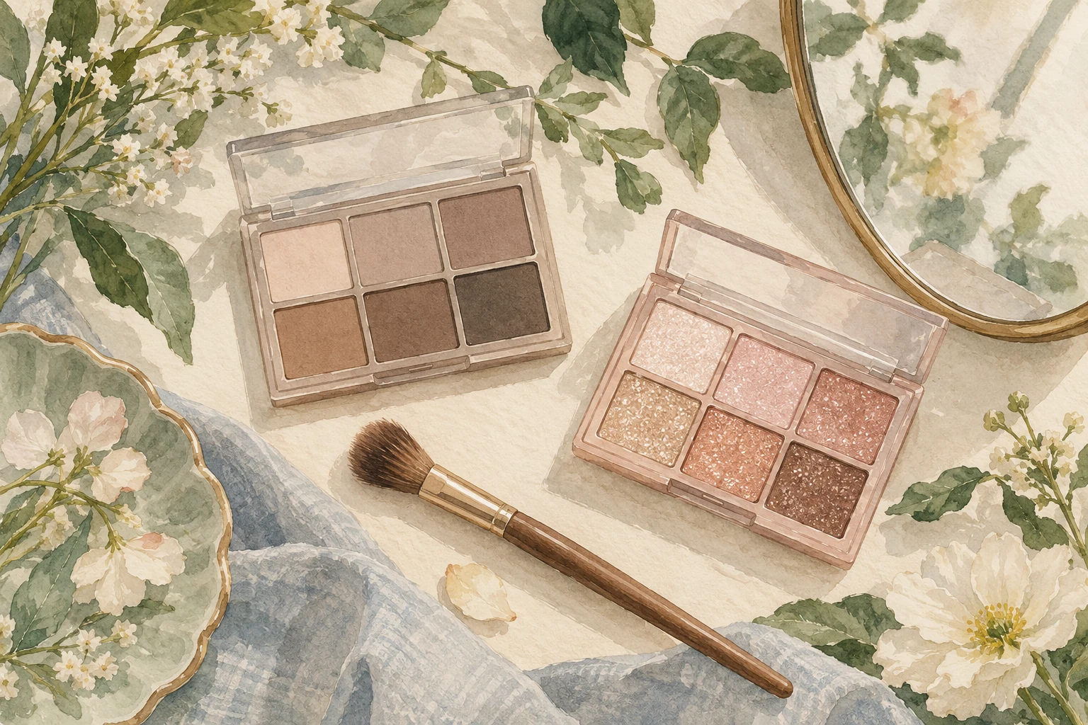
A ten-shade eyeshadow palette can be a complete everyday set, a collection of sparkling accents or a group of matte colours for definition. The number of pans does not tell you which of those jobs it can do.
romand's Better Than Palette makes the difference unusually clear. The brand describes 00 Light & Glitter Garden as ten glitters, while 05 Shade & Shadow Garden is an all-matte selection. Buying one because it has as many shades as the other would miss the main point of each.
Three jobs to look for
Before deciding how many colours you need, think about the parts of an eye look you actually want to make:
- A base or soft wash: a shade that gives the lid the starting appearance you want.
- Definition: a deeper or differently toned shade used to give shape or emphasis.
- Light or sparkle: a finish that catches the light and changes how a small area looks.
Those are roles, not a compulsory three-colour routine. You may want only one soft wash, or a little sparkle over a base you already own. A palette becomes useful when its particular mixture supports that plan.
It also means an apparently repetitive row of matte browns can have a purpose. Differences in lightness can help with gradual definition even when the colours look related in the box. Conversely, ten noticeably different glitters can still share the same broad accent job.
What the two romand palettes illustrate
For 00 Light & Glitter Garden, romand's description emphasises different colours and particles of sparkle. It makes sense to consider this as a collection of finishes you can add to a look. It is not the obvious place to look for a matte base and a matte contour shade.
For 05 Shade & Shadow Garden, the all-matte description points towards definition and tonal changes. It is the clearer candidate if you are choosing a palette to give shape without adding shine. It cannot supply a glitter finish just because the range's general product page also talks about sparkle.
That is a useful way to read application instructions too. A general sequence that says to apply a matte base, deepen the outer area and tap on glitter assumes you own those finishes. Check that the particular palette contains the role the instruction is asking it to play.
Those finish descriptions tell you which roles to look for. They still leave the question of how a particular shade will appear on your own skin, which is where depth becomes useful.
Look for depth as well as warm or cool
Warm and cool labels can help narrow colour preferences, but they do not show how light or deep each pan is relative to your own skin. Two shades may sit in a similar colour family and still have very different uses because one is much deeper.
For a definition-focused palette, look at whether the light-to-deep changes match the look you want. For a sparkle collection, look at the type and intensity of the finishes you would actually use. You do not have to force both purchases through the same checklist.
Your existing makeup matters as well. A new accent palette can make sense alongside a matte shade you already enjoy. If you are trying to build a small first set, a mixed palette may be a more straightforward starting point than buying a large single-finish collection and then discovering what is missing.
A small map before the next purchase
Take the palette you own, or the one you are considering, and assign each shade a likely role. Mark the colours you can imagine using for a soft wash, for definition and for an accent. Leave a shade unassigned if it has no obvious place in the looks you enjoy.
The aim is not to prove that every pan must be used equally. One favourite colour can make a palette enjoyable. The map simply reveals what a new palette adds and what it mostly repeats.
If most of your unused shades are large glitters, another glitter collection deserves a different question from a matte everyday set. If you already have the base and definition colours you need, an accent palette can be a deliberate choice rather than an incomplete one.
Count the shades after you understand the jobs. A useful palette earns its place through the looks you can make with it, not the size of the number printed beside its name.