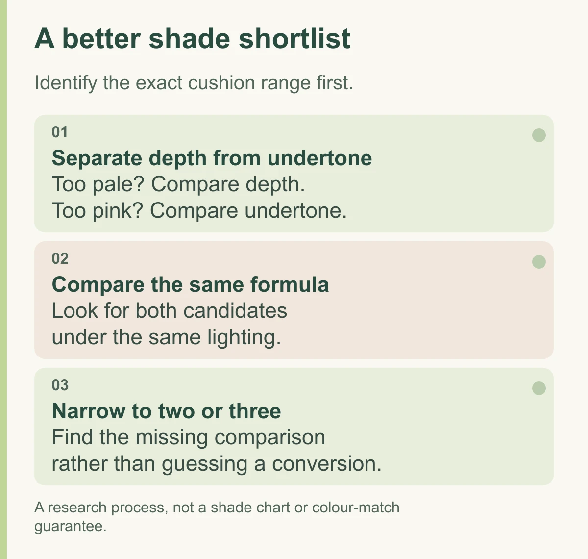
On a TIRTIR Red Cushion shade code, the number points to depth and the letter points to undertone. C means cool, N neutral and W warm. Start by separating those two decisions: how light or deep the foundation needs to be, then whether its colour direction suits your skin.
For example, 21C, 21N and 21W are alternatives around the same numbered depth, with different undertone directions. Going from 21N to 21W changes the undertone choice; going from 21N to 23N moves towards a deeper neutral option. The code makes the shortlist much easier to understand.
TIRTIR is a Korean makeup brand. This guide focuses on Red Cushion shade codes and choosing between nearby options; the Tinted Skin Glow guide covers that different cushion.
For the full colour chart, start with the official global Red Cushion page or TIRTIR’s shade finder. The global page presents a 40-shade range, while the NEW range mapped below has 20 options. Use the chart for the version you are buying; this guide’s tables explain the codes, rather than reproduce skin swatches.
Read the code before the shade name
The numbers broadly run from lighter to deeper shades within the same range. They aren't a skin-colour measurement, and the spacing between numbers isn't a fixed amount of colour change. A 21 in another brand also needn't match TIRTIR's 21.
| Part of the code | What it means | What to compare |
|---|---|---|
| Number, such as 17, 21 or 23 | Relative depth within that range | Does it look too light, too deep or close to your skin? |
| C: cool | A cooler colour direction, often pinker | Does a warmer option look too yellow on you? |
| N: neutral | A balance between cool and warm | Do strongly pink or yellow options both look wrong? |
| W: warm | A warmer colour direction, often more yellow or golden | Does a cooler option look too pink on you? |
Undertone means the underlying colour direction, rather than simply how pale or dark you are. “Neutral” is a shade category, not a guarantee that the foundation will be colourless on every face. Use the letters to find sensible comparisons, then judge the actual colour.
A practical map of the NEW Red Cushion options
As checked on 11 October 2026, the NEW Mask Fit Red Cushion Foundation range has 20 shades. The following groups show which alternatives exist at nearby depths. This is a code map, not a set of measured skin swatches.
| Depth group | Options in the NEW range |
|---|---|
| 10.5–15.5 | 10.5N, 11N, 12N, 13N, 15C, 15.5N |
| 17 | 17C, 17N, 17W |
| 19 | 19C, 19N |
| 21 | 21C, 21N, 21W |
| 22 | 22C, 22N, 22W |
| 23–24 | 23N, 24N, 24W |
For the 21 group, the shade names are 21C Cool Ivory, 21N Ivory and 21W Natural Ivory. The letters are the clearest guide to their intended difference; “Natural” doesn't mean it will suit everyone.
Narrow the shortlist by fixing one mismatch at a time
Use a foundation that currently matches you as a reference. Write down its full name and shade so that a comparison doesn't accidentally mix different formulas.
- The depth is close, but the foundation looks too pink: compare a neutral or warm option around that numbered depth first. For a 21C candidate, 21N and 21W are the relevant alternatives to investigate.
- The undertone is close, but it looks too pale: look towards a deeper option in the same undertone family. In the NEW neutral group, 21N, 22N and 23N give you neighbouring choices to compare.
- It looks too dark but the undertone is close: move towards a lower-numbered option in that family. Not every depth comes in all three letters, so use the available options rather than assume a missing code exists.
- Every option looks too pink or yellow: don't keep changing depth to solve that colour problem. The undertone match may be the obstacle, and the available range may not give you a good one.
That gives you a useful order of decisions: correct depth and undertone separately, then compare the available candidates.
Choose swatches that answer your question
For two or three candidates, look for actual swatches side by side under the same lighting, with the exact cushion range named. Digital shade tiles help organise the catalogue but can't show how a thin layer will look on skin.
If a tester is available, apply a small amount around the jaw and compare it with your face and neck in daylight and ordinary indoor light. Let the product settle before deciding. A thick fresh stripe is a different view from the thin layer you'd wear over your face.
“Buy one shade lighter” is a poor blanket rule. If the formula changes colour on you after application, compare the fresh and settled appearance in similar light. A warmer photograph or someone else's experience isn't enough reason to pre-correct your own shade.
The shade finder can provide a starting suggestion, but check that its result exists in the range you are buying. Use the number and letter to narrow your options, then compare the actual colours in that same formula.
If you are still deciding on the format, our cushion vs liquid foundation comparison separates the portable compact from the formula inside.
The most useful shortlist is one you can explain: the right range, a depth close to your skin and an undertone direction that makes sense. Start with the number and letter, then use a same-formula swatch or tester to choose between the remaining options. That's a much firmer basis than treating 21N as a universal answer.